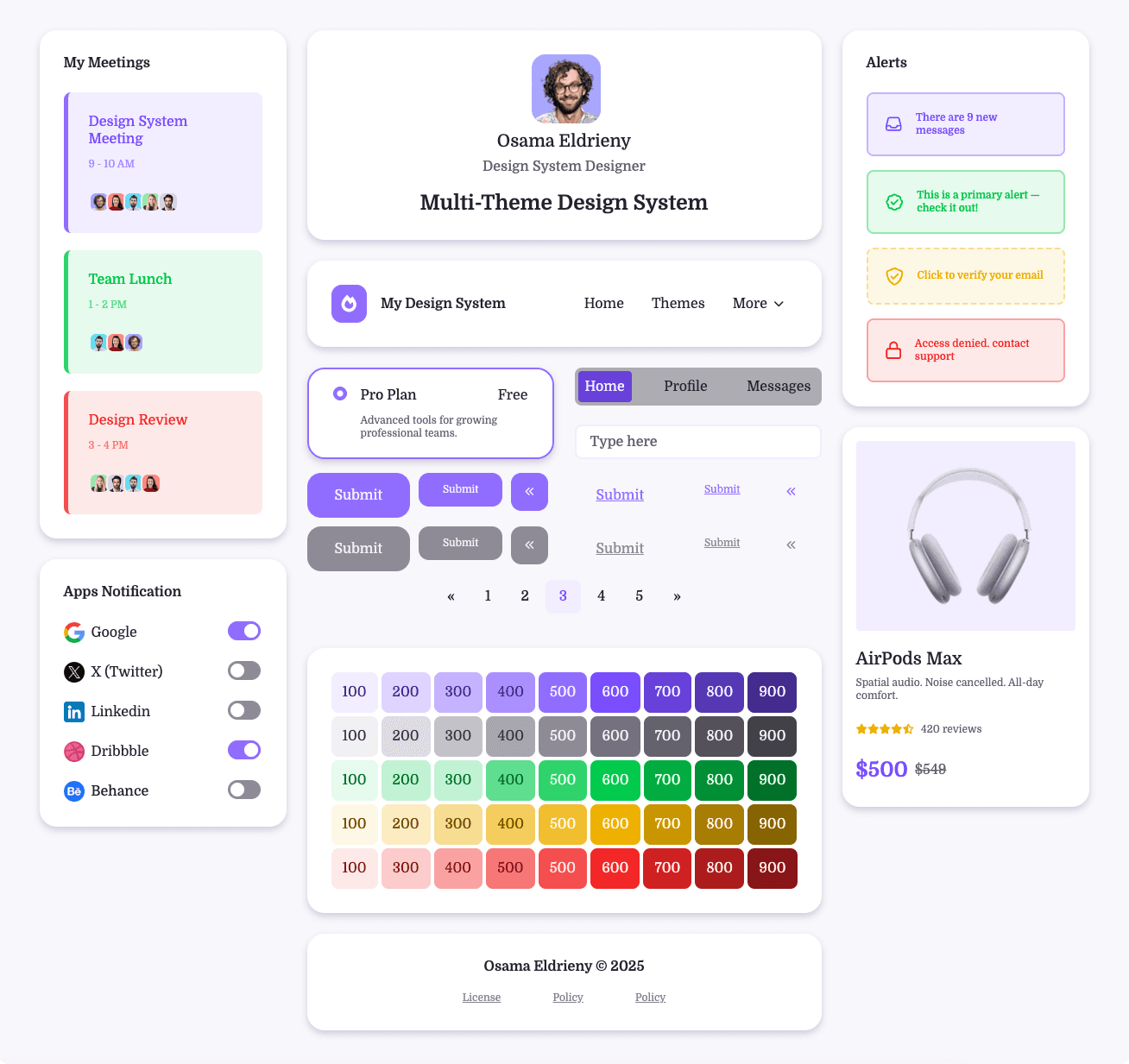
Multi-Theme Design System
Designing for Scalability Before It Breaks
Overview
Goal
To prove that a token-based design system can support unlimited themes across brands, modes, and platforms without redesigning components or adding manual developer work.
Why this matters
Many teams discover months too late that their token structure doesn’t scale. This project was designed to avoid that failure upfront and serve as a repeatable blueprint for real-world teams.
The Core Question
This project answers that question through:
How do you build a multi-theme design system that remains flexible, scalable, and automated—without discovering structural flaws after months of work?
A tested token architecture
A real Figma → code pipeline
Custom tooling to remove human error
Clear rules for designers and developers
What “Multi-Theme” Means in This System
This system supports independent, combinable themes, allowing teams to mix options freely without breaking components.
Supported Theme Dimensions
Brand: Diamond, Amber, Opal
Color: Light, Dark
Language: English, Arabic
Typography: Serif, Sans-serif
Density: Comfortable, Compact
Radius: Square, Round, Pills
Shadow: Flat, Subtle, Default, Raised
✅ Any combination works
✅ New themes can be added
✅ Components remain untouched
✅ No extra developer work required
Brands Theme

Diamond

Amber

Opal
Colors Theme
Light


Dark
Language Theme

English

Arabic
Typography Theme
Serif


Sans Serif
Radius Theme
Square

Round

Pills
Density Theme
Comfortable

Compact
Shadow Theme

Flat

Subtle

Default

Raised
My Role
Leading the System
This project was built as part of a design tokens bootcamp, where I intentionally took on all roles to ensure the system could be taught, repeated, and validated end to end.
Led the design system strategy
Defined the token architecture
Owned naming, theming, and workflow
Designed the Figma → code pipeline
Built automation tools
Validated the system with developers
Step 1 — Understanding Components from a Front-End Perspective
Before defining tokens, I studied:
The existing component code library
How components consume values in code
Which values are hard dependencies vs configurable
Why this matters
If tokens don’t match how components are built in code, automation will always break.
Tokens were treated as API contracts, not visual variables.

Step 2 — Defining What Changes vs What Stays the Same
A critical early exercise
What changes between themes?
All colors change based on "Brand theme" and "Color Theme"


Font family, Font size, Font weight and Line height are change based on "Language theme" and "Typography theme"

Direction, Text content, Border width right and left are change based on "Language theme"

Density theme control all the spacing "Padding, Margin, Gap"

Radius theme only control "Border Radius"

Shadow theme control the shadow style "X, Y, Blur

What never changes?
Component structure
Layout logic
Interaction behavior
Size (Width, Height), and Opacity
This can be different for other projects
Maybe some colors stays same for all brands
Maybe some spaces stays same for all themes
Maybe some spaces change based on breakpoints
Step 3 — Naming Is Not Cosmetic (It’s Structural)
A consistent naming system was mandatory.
Naming principles:
Meaning over appearance
Shared language between design & dev
Predictable hierarchy
Theme-agnostic tokens
This ensured:
Tokens remain stable over time
Designers can change decisions safely
Developers never need manual overrides
Step 4 — Token Levels: Why Three Levels Won
We tested 2-level vs 3-level architectures.
The final structure:
Primitive tokens
Raw values (colors, numbers, strings)
Semantic tokens
Meaningful roles (background, text, border)
Component tokens
Component-specific mapping
Why not 2 levels?
Change Design decisions would force manual developer changes
Automation would break when designers reassign intent
Why 3 levels?
Clear separation of concerns
Safe design iteration
Full automation from Figma to code
Step 5 — Token Architecture Is the Most Important Decision
We evaluated multiple architectures using success criteria:
Success Criteria
Can add a new theme without touching components
Can change design decisions without breaking code
Can scale across platforms
Can be understood by new team members
We rejected architectures that:
Coupled themes to components
Mixed semantics and values
Required manual mapping in code

Step 6 — Pilot Test: Proving the System Early
Failure here would have stopped the system entirely.
Instead of building everything:
We chose one small component
Planned tokens
Assigned variables
Defined theme structure
Exported to code
Tested in the browser
This validated:
Flexibility
Scalability
Automation
Developer experience
Pilot test examples
Started with very small component first

Then we scale to other small component

Step 7 — Bridging Figma and Code (The Hard Part)
The Problem
Time consuming while planning, creating the tokens
Naming token is hard
Existing plugins generated unreliable CSS
Platform differences required manual fixes
Variable types weren’t handled correctly
No free tools to manage the themes in code
The Solution
I built custom tools:
Tokens Generator tool, to make the planning, naming, creating tokens much faster
Variables to JSON Plugin, to convert the variable to JSON that can be converted to any platform code
Theme Manager tool, to manage the theming easily with no-code experience
Helping the community
I shared all these tools under one domain (Design Tokens Toolbox - dttb) to help other teams to save time and effort

Step 8 — Testing & Validation
The Problem
Tested in Figma
Tested in the browser
Added new brands and modes
Switched themes with zero refactoring
Verified automatic code updates
Testing on Figma

Testing on the browser

Results & Impact
Theme creation time reduced from days to hours
100% automated code generation
Added 5 new brand themes without touching components
Designers work independently from developers
80% faster design-dev handoff
Consistent UI across platforms
Reusable blueprint for future systems

Lessons Learned
Token architecture decisions compound over time
Naming is a system decision, not a preference
Pilot testing prevents months of wasted effort
Automation is the only way to scale themes
Design systems are infrastructure, not assets